1. Payload Type Development
6. Browser Scripting
What is Browser Scripting?
Browser scripting is a way for you, the agent developer or the operator, to dynamically adjust the output that an agent reports back. You can turn data into tables, download buttons, screenshot viewers, and even buttons for additional tasking.Where are Browser Scripts?
As a developer, your browser scripts live in a folder calledbrowser_scripts in your mythic folder. These are simply JavaScript files that you then reference from within your command files such as:
You need to supply
for_new_ui=True in order for the script to be leveraged for the new user interface. If you don’t do this, Mythic will attach the script to the old user interface. All of the following documentation is for the new user interface.What can I do via Browser Scripts?
Browser Scripts are JavaScript files that take in a reference to the task and an array of the responses available, then returns a Dictionary representing what you’d like Mythic to render on your behalf. This is pretty easy if your agent returns structured output that you can then parse and process. If you return unstructured output, you can still manipulate it, but it will just be harder for you.Plaintext
The most basic thing you can do is return plaintext for Mythic to display for you. Let’s take an example that simply aggregates all of the response data and asks Mythic to display it:responses and aggregates all of the responses into one string called combined then asks Mythic to render it via: {'plaintext': combined}.
Plaintext is also used when you don’t have a browserscript set for a command in general or when you toggle it off. This uses the react-ace text editor to present the data. This view will also try to parse the output as JSON and, if it can, will re-render the output in pretty print format.
Screenshots
A slightly more complex example is to render a button for Mythic to display a screenshot.-
If the task status includes the word “error”, then we don’t want to process the response like our standard structured output because we returned some sort of error instead. In this case, we’ll do the same thing we did in the first step and simply return all of the output as
plaintext. -
If the task is completed and isn’t an error, then we can verify that we have our responses that we expect. In this case, we simply expect a single response with some of our data in it. The one piece of information that the browser script needs to render a screenshot is the
agent_file_idorfile_idof the screenshot you’re trying to render. If you want to return this information from the agent, then this will be the samefile_idthat Mythic returns to you for transferring the file. If you display this information viaprocess_responseoutput from your agent, then you’re likely to pull the file data via an RPC call, and in that case, you’re looking for theagent_file_idvalue. You’ll notice that this is an array of identifiers. This allows you to supply multiple at once (for example: you took 5 screenshots over a few minutes or you took screenshots of multiple monitors) and Mythic will create a modal where you can easily click through all of them. -
To actually create a screenshot, we return a dictionary with a key called
screenshotthat has an array of Dictionaries. We do this so that you can actually render multiple screenshots at once (such as if you fetched information for multiple monitors at a time). For each screenshot, you just need three pieces of information: theagent_file_id, thenameof the button you want to render, and thevariantis how you want the button presented (containedis a solid button andoutlinedis just an outline for the button). -
If we didn’t error and we’re not done, then the status will be
processed. In that case, if we have data we want to also display the partial screenshot, but if we have no responses yet, then we want to just inform the user that we don’t have anything yet.
Downloads
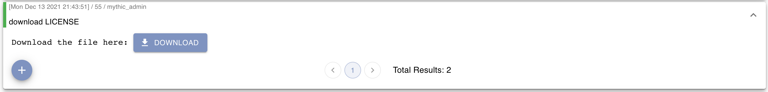
When downloading files from a target computer, the agent will go through a series of steps to register a file id with Mythic and then start chunking and transferring data. At the end of this though, it’s super nice if the user is able to click a button in-line with the tasking to download the resulting file(s) instead of then having to go to another page to download it. This is where the download browser script functionality comes into play. With this script, you’re able to specify some plaintext along with a button that links to the file you just downloaded. However, remember that browser scripts run in the browser and are based on the data that’s sent to the user to view. So, if the agent doesn’t send back the newagent_file_id for the file, then you won’t be able to link to it in the UI. Let’s take an example and look at what this means:
-
Like many other browser scripts, we’re going to modify what we display to the user based on the status of the task as well as if the agent has returned anything for us to view or not. That’s why there’s checks based on the
task.statusandtask.completedfields. -
Assuming the agent returned something back and we completed successfully, we’re going to parse what the agent sent back as JSON and look for the
file_idfield. -
We can then make the download button with a few fields:
-
agent_file_idis the file UUID of the file we’re going to download through the UI -
variantallows you to control if the button is a solid or just outlined button (containedoroutlined) -
nameis the text inside the button -
plaintextis any leading text data you want to dispaly to the user instead of just a single download button
-
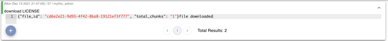
file_id which we use to pass in as agent_file_id for the browser script, and total_chunks. total_chunks isn’t strictly necessary for anything, but if you look back at the script, you’ll see that we display that as plaintext to the user while we’re waiting for the download to finish so that the user has some sort of idea how long it’ll take (is it 1 chunk, 5, 50, etc).
download key is an array. So yes, if you’re downloading multiple files, as long as you can keep track of the responses you’re getting back from your agent, you can render and show multiple download buttons.
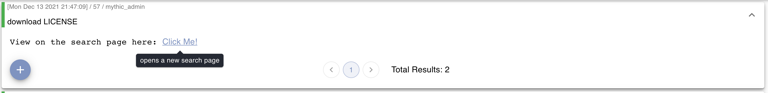
Search Links
Sometimes you’ll want to link back to the “search” page (tasks, files, screenshots, tokens, credentials, etc) with specific pieces of information so that the user can see a list of information more cleanly. For example, maybe you run a command that generated a lot of credentials (like mimikatz) and rather than registering them all with Mythic and displaying them in the task output, you’d rather register them with Mythic and then link the user over to them. Thats where the search links come into play. They’re formatted very similar to the download button, but with a slight tweak.download example, but the actual dictionary we’re returning is a little different. Specifically, we have:
-
plaintextas a string we want to display before our actual link to the search page -
hoverTextas a string for what to display as a tooltip when you hover over the link to the search page -
searchis the actual query parameters for the search we want to do. In this case, we’re showing that we want to be on thefilestab, with thesearchFieldofFilename, and we want the actualsearchparameter to be what is shown to the user in the display parameters (display_params). If you’re ever curious about what you should include here for your specific search, whenever you’re clicking around on the search page, the URL will update to reflect what’s being shown. So, you can navigate to what you’d want, then copy and paste it here. -
nameis the text represented that is the link to the search page.
search responses.
Tables
Creating tables is a little more complicated, but not by much. The biggest thing to consider is that you’re asking Mythic to create a table for you, so there’s a few pieces of information that Mythic needs such as what are the headers, are there any custom styles you want to apply to the rows or specific cells, what are the rows and what’s the column value per row, in each cell do you want to display data, a button, issue more tasking, etc. So, while it might seem overwhelming at first, it’s really nothing too crazy. Let’s take an example and then work through it - we’re going to render the following screenshot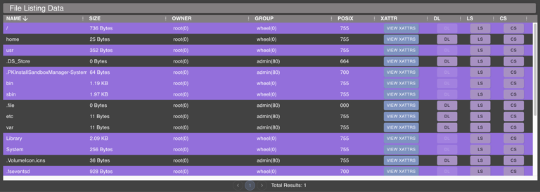
table which has an array of Dictionaries. This means that you can have multiple tables if you want. For each one, we need three things: information about headers, the rows, and the title of the table itself. Not too bad right? Let’s dive into the headers:
plaintext, type, and optionally width. As you might expect, plaintext is the value that we’ll actually use for the title of the column. type is controlling what kind of data will be displayed in that column’s cells. There are a few options here: string (just displays a standard string), size (takes a size in bytes and converts it into something human readable - i.e. 1024 -> 1KB), date (process date values and display them and sort them properly), number (display numbers and sort them properly), and finally button (display a button of some form that does something). The last value here is width - this is a pixel value of how much width you want the column to take up by default. If you want one or more columns to take up the remaining widths, specify "fillWidth": true. Columns by default allow for sorting, but this doesn’t always make sense. If you want to disable this ( for example, for a button column), set "disableSort": true in the header information.
Now let’s look at the actual rows to display:
rowStyle
As you might expect, you can use this key to specify custom styles for the row overall. In this example, we’re adjusting the display based on if the current row is for a file or a folder.plaintext
If we’re displaying anything other than a button for a column, then we need to include theplaintext key with the value we’re going to use. You’ll notice that aside from rowStyle, each of these other keys match up with the plaintext header values so that we know which values go in which columns.
In addition to just specifying the plaintext value that is going to be displayed, there are a few other properties we can specify:
-
startIcon- specify the name of an icon to use at the beginning of theplaintextvalue. The availablestartIconvalues are:- folder/openFolder, closedFolder, archive/zip, diskimage, executable, word, excel, powerpoint, pdf/adobe, database, key, code/source, download, upload, png/jpg/image, kill, inject, camera, list, delete
-
^ the above values also apply to the
endIconattribute
-
startIconHoverText- this is text you want to appear when the user hovers over the icon -
endIconthis is the same as thestartIconexcept it’s at the end of the text -
endIconHoverTextthis is the text you want to appear when the user hovers over the icon -
plaintextHoverTextthis is the text you want to appear when the user hovers over the plaintext value -
copyIcon- use this to indicate true/false if you want acopyicon to appear at the front of the text. If this is present, this will allow the user to copy all of the text inplaintextto the clipboard. This is handy if you’re displaying exceptionally long pieces of information. -
startIconColor- You can specify the color for your start icon. You can either do a color name, like"gold"or you can do an rgb value like"rgb(25,142,117)". -
endIconColor- this is the same as thestartIconColorbut applies to any icon you want to have at the end of your text
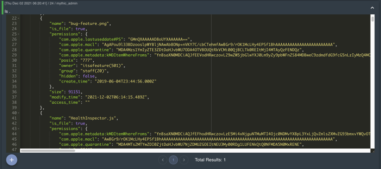
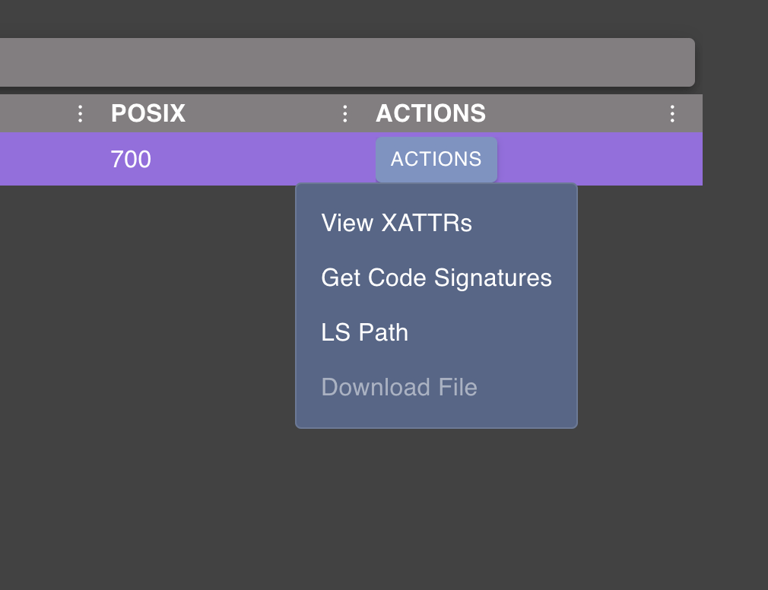
dictionary button
The first kind of button we can do is just a popup to display additional information that doesn’t fit within the table. In this example, we’re displaying all of Apple’s extended attributes via an additional popup.name is the name of the button you want to display to the user. the type field is what kind of button we’re going to display - in this case we use dictionary to indicate that we’re going to display a dictionary of information to the user. The other type is task that we’ll cover next. The value here should be a Dictionary value that we want to display. We’ll display the dictionary as a table where the first column is the key and the second column is the value, so we can provide the column titles we want to use. We can optionally make this button disabled by providing a disabled field with a value of true. Just like with the normal plaintext section, we can also specify startIcon, startIconColor.Lastly, we provide a title field for what we want to title the overall popup for the user.
string button
If the data you want to display to the user isn’t structured (not a dictionary, not an array), then you probably just want to display it as a string. This is pretty common if you have long file paths or other data you want to display but don’t fit nicely in a table form.startIcon, startIconColor, and hoverText for this button as well.
task button
This button type allows you to issue additional tasking.name and type fields as the dictionary button. Just like with the dictionary button we can make the button disabled or not with the disabled field. You might be wondering which task we’ll invoke with the button. This works the same way we identify which command to issue via the file browser or the process browser - ui_feature. These can be anything you want, just make sure you have the corresponding feature listed somewhere in your commands or you’ll never be able to task it. Just like with the dictionary button, we can specify startIcon and startIconColor. The openDialog flag allows you to specify that the tasking popup modal should open and be partially filled out with the data you supplied in the parameters field. Similarly, the getConfirmation flag allows you to force an accept/cancel dialog to get the user’s confirmation before issuing a task. This is handy, especially if the tasking is something potentially dangerous (killing a process, removing a file, etc). If you’re setting getConfirmation to true, you can also set acceptText to something that makes sense for your tasking, like “yes”, “remove”, “delete”, “kill”, etc.
The last thing here is the parameters. If you provide parameters, then Mythic will automatically use them when tasking. In this example, we’re pre-creating the full path for the files in question and passing that along as the parameters to the download function.
-
Remember: your
parse_argumentsfunction gets called when your input isn’t a dictionary or if yourparse_dictionaryfunction isn’t defined. So keep that in mind - string arguments go here -
when you issue
ls -Path some_pathon the command line, Mythic’s UI is automatically parsing that into{"Path": "some_path"}for you and since you have a dictionary now, it goes to yourparse_dictionaryfunction - when you set the parameters in the browser script, Mythic doesn’t first try to pre-process them like it does when you’re typing on the command.
-
If you want to pass in a parsed parameter set, then you can just pass in a dictionary. So,
"parameters": {"Path": "my path value"}. -
If you set
"parameters": "-Path some_path"just like you would type on the command line, then you need to have aparse_argumentsfunction that will parse that out into the appropriate command parameters you have. If your command doesn’t take any parameters and just uses the input as a raw command line, then you can do like above and have"parameters": "path here"
table button
Sometimes the data you want to display is an array rather than a dictionary or big string blob. In this case, you can use thetable button type and provide all of the same data you did when creating this table to create a new table (yes, you can even have menu buttons on that table).
menu button
Tasking and extra data display button is nice and all, but if you have a lot of options, you don’t want to have to waste all that valuable text space with buttons. To help with that, there’s one more type of button we can do:menu. With this we can wrap the other kinds of buttons:
task and dictionary buttons as before, but they’re just in an array format now. It’s as easy as that. You can even keep your logic for disabling entries or conditionally not even add them. This allows us to create a dropdown menu like the following screenshot:
startIcon , startIconColor , and hoverText, properties.
Media
If you have certain kinds of media you’d like to display right inline with your tasking, you can do that. All you need is theagent_file_id (the UUID value you get back when registering a file with Mythic) and the filename of whatever media it is you’re trying to show.
media key that sets the filename to be the display parameters for the task (in this case it was a download command so the display parameters are the path to the file to download) and the agent_file_id is set to the file_id that was returned as part of the agent’s tasking. In this case, the raw agent user_output was:
media button on the file downloads page.
Graphs
If you want to render your data in a graph view rather than a table, then you can do that now too! This uses the same graphing engine that the active callback’s graph view uses. There are three main pieces for returning graph data:nodes, edges, and a group_by string where you can optionally group your nodes via certain properties.
Nodes
Each node has a few properties:-
id- this is a unique way to identify this node compared to others. This is also how you’ll identify the node when it comes to creating edges. -
img- if you want to display an image for your node, you give the name of the image here. Because this is React, we need to identify these all ahead of time. For now, the available images are as follows: group, computer, user, lan, language, list, container, help, diamond, skull. We can always add more though - if you find a free icon on Font Awesome or Material UI then let me know and I can get that added. -
style- this is where you can provide React styles that you want applied to your image. These are the same as CSS styles, except that-are removed and camel casing is used instead. For example, instead of an attribute ofbackground-colorlike normal CSS, you’d define it asbackgroundColor. -
overlay_img- this is the same asimgexcept that you can define a SECOND image to have overlayed on the top right of your original one. -
overlay_style- this is the same asstyleexcept that it applied tooverlay_imageinstead ofimg. -
data- this is where any information about your actual node lives- there should be a
labelvalue in here that’s used to display the text under your node
- there should be a
-
buttons- this is an array of button actions you’d like to add to the context menu of your node. This is the same as the normal buttons from Tables, except there’s no need for amenubutton.
Edges
Each edge has a few properties:-
source- all of the data (as a dictionary) about the source node. Mythic will try to do things likesource.idto get the ID for the source node. -
destination- all of the data (as a dictionary) about the destination/target node. -
label- the text to display as a label on the edge -
data- dictionary of information about your edge -
animate- boolean true/false if you want the edge the be animated or a solid color -
color- the color you want the edge to be -
buttons- this is an array of button actions you’d like to add to the context menu of your edge.